Step 6: Construct Climate Change Projections
Two useful ways to apply climate projections using a simple scaling approach are to show changes in average climate and days under or over thresholds, such as triggers of known impacts from extreme climate events.
Presenting climate change projections in terms of average climate is very useful. For example, the average climate determines the average growing conditions for agriculture. The average air temperature and rainfall regimes determine the suitability of certain farming methods and crop types, and geographic zones where pests and diseases are common, along with many other useful things for planning sustainable agricultural development.
Sometimes it is hard to relate a climate impact for any one sector to the average climate, and it is more relevant to look at climate extremes such as the number of days over or under a critical threshold. A threshold may be the number of very hot days, or the number of cool nights, which collectively or independently may affect human health or are important for some crops to grow.
Options
- Construct projections as changes in average climate
- Construct projections as days over or under thresholds
Construct projections as changes in average climate
The average climate is generally measured over a 30-year period, and it changes over time. When preparing and presenting projections using this approach, it is important to be clear that we are using the 30-year average. Individual years will be higher or lower than this.
This approach is particularly useful to show changes in the average climate across an area in space. Since the spatial patterns are the focus here, and we don’t need a time series dataset, we can focus on high-resolution maps of climate conditions, such as for maximum temperature, and then look in detail at the respective climate zones.
To construct projections as changes in average climate:
- Gather the inputs: the observed dataset (collected in step 4), the relevant thresholds (identified in step 2) and the scaling factors (see step 5)
- Apply the scaling factors to the observed data. Scaling absolute changes, such as for temperature, is done by an addition; proportional changes (%) are applied by multiplication.
Change factors are applied to the relevant geographic area. If you have a single change factor for the whole area (e.g. for a country in the PACCSAP reports), then this one value is applied everywhere. If you have a spatial map of change, then this should be applied in space.
For example, high-resolution maps of daily maximum temperature for Viti Levu island in Fiji taken from the 2014 PACCSAP report are shown in the following figure.
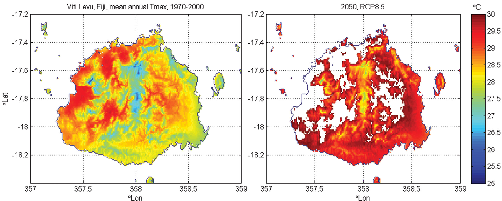
The map on the left shows the mean annual Tmax (the daily maximum temperature) in 1970–2000 using the WorldClim dataset. Note that the temperatures are cooler in the mountains than at the coast. On the right is a map of the same area with a change factor of 1.4 °C applied (this is the median projection for 2050 under high emissions (RCP8.5); the model range is 0.6 to 2 °C). Values over 30 °C are blanked out, so if this threshold were meaningful (say, a cropping zone is marginal at 30 °C), then this new zoning would be notable.
Construct projections as days over or under thresholds
Good-quality daily observation datasets are required for this analysis to understand the current climate. The same threshold can then be examined in the projected future climate.
To construct projections as days over or under thresholds:
- Gather the inputs: the observed dataset (collected in step 4), the relevant thresholds (identified in step 2) and the scaling factors (see step 5)
- Calculate the days under/over the threshold in the observed climate.
- Apply the scaling factors to the observed data. Absolute changes, such as for temperature scaling, are done by an addition; proportional changes (%) are applied by multiplication.
- Calculate the days under/over the threshold in the future dataset.
In the example, in the following figure, the graph on the left shows that in the past there were 12 days below the 30 °C threshold of interest in this period for Darwin, Australia. Hypothetically, if the climate is scaled up by 2 °C (say due to global warming), then there are only two days below this threshold.
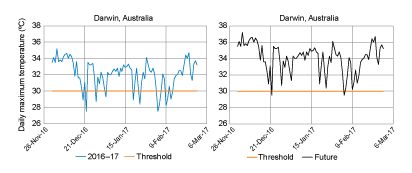
It is important to note that this example shows only three months, for the purposes of clearly showing the effect of scaling. To take account for natural climate variability, this analysis should be done on 30 years of data.
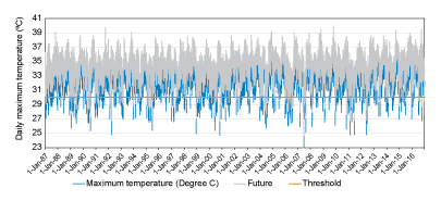
This gives more reliable results (9.8 days/season now, 1.6 days/season with +2 °C). Even when 30 years of data are used, results will show the effect of the change in the average, with no change to natural climate variability. In practice, changes to natural climate variability are in fact possible and should be noted when the results of such an analysis are discussed.
IMPORTANT: Provide information about the confidence and uncertainty in climate projections so the limitations of the data are taken into account in decision making.
CASE STUDY EXAMPLES
NEXT STEP
- If using projections for risk assessment, go to Step 7: Assess climate change risk
- If not using projections for a risk assessment, go to Step 8: Communicate climate change information